Blog
Look Longer At These Logos
 Your logo is what most consumers will first associate with your business. It is the design that represents your business name and what it stands for. In many cases, your logo is what will help to separate your from your competition. The more recognizable your logo is, the more people will associate success and reliability with your company. So what’s in a logo?
It’s more than just a symbol of your brand. Often, logos send a message – even subliminal ones. At MeloTel, we have a very talented staff comprised of graphic designers who aim to create the most unique logos for businesses of all types. Have a look at our various Business Logo Design packages to determine which one may be right for you.
It’s important not to underestimate the power of a logo. It’s also important to take a deeper look into the logos that many companies out there have. Last week, QMI Agency posted an interesting article on The Toronto Sun’s website unveiling some pretty clever details about some popular brand logos. Many of them have deeper meanings than what first hits the eye.
Take the Tostitos logo, for example. A closer look at the text for this popular snack’s logo reveals two people sharing a chip over a bowl of salsa. The people are represented by two letter “t’s” and the salsa is dotting the letter “i”. QMI points out that the logo conveys the company’s encouragement of sharing and making connections with people.
The Tour De France logo is another interesting one. What may first appear as a logo made up of a simple modern text is actually one that incorporates a bicycle rider. The designer cleverly made the letter “r” in the word “tour” the rider while the letter “o” in “tour” represents the bike’s back wheel. The yellow circle, of course, is the front wheel.
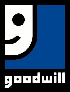
Making unique images out of letters seems to be a common trend among logo designers. But it’s a cool technique time in and time out. The Goodwill Industries logo is another great example. Do you notice how the smiley face in the logo doubles as the “g” in the name of the company?
One of our favourite logos is for a sports team that doesn’t even use the design anymore. But Major League Baseball’s Milwaukee Brewers used to use one of the most clever logos in sports. The glove holding a baseball seemed like a simple enough logo…until a closer look reveals that the logo is actually the letters “m” and “b”.
What would you like to be part of your logo? At MeloTel, we are only too excited to get working on a logo that may have the most clever design you’ve even seen. Let us know what you’d like to communicate about your company. And we’ll find the most interesting way to express that to the world. Your new business logo awaits you! Call us at 1-888-MELOTEL.
Look Longer At These Logos
 Your logo is what most consumers will first associate with your business. It is the design that represents your business name and what it stands for. In many cases, your logo is what will help to separate your from your competition. The more recognizable your logo is, the more people will associate success and reliability with your company. So what’s in a logo?
It’s more than just a symbol of your brand. Often, logos send a message – even subliminal ones. At MeloTel, we have a very talented staff comprised of graphic designers who aim to create the most unique logos for businesses of all types. Have a look at our various Business Logo Design packages to determine which one may be right for you.
It’s important not to underestimate the power of a logo. It’s also important to take a deeper look into the logos that many companies out there have. Last week, QMI Agency posted an interesting article on The Toronto Sun’s website unveiling some pretty clever details about some popular brand logos. Many of them have deeper meanings than what first hits the eye.
Take the Tostitos logo, for example. A closer look at the text for this popular snack’s logo reveals two people sharing a chip over a bowl of salsa. The people are represented by two letter “t’s” and the salsa is dotting the letter “i”. QMI points out that the logo conveys the company’s encouragement of sharing and making connections with people.
The Tour De France logo is another interesting one. What may first appear as a logo made up of a simple modern text is actually one that incorporates a bicycle rider. The designer cleverly made the letter “r” in the word “tour” the rider while the letter “o” in “tour” represents the bike’s back wheel. The yellow circle, of course, is the front wheel.
Making unique images out of letters seems to be a common trend among logo designers. But it’s a cool technique time in and time out. The Goodwill Industries logo is another great example. Do you notice how the smiley face in the logo doubles as the “g” in the name of the company?
One of our favourite logos is for a sports team that doesn’t even use the design anymore. But Major League Baseball’s Milwaukee Brewers used to use one of the most clever logos in sports. The glove holding a baseball seemed like a simple enough logo…until a closer look reveals that the logo is actually the letters “m” and “b”.
What would you like to be part of your logo? At MeloTel, we are only too excited to get working on a logo that may have the most clever design you’ve even seen. Let us know what you’d like to communicate about your company. And we’ll find the most interesting way to express that to the world. Your new business logo awaits you! Call us at 1-888-MELOTEL.
